Email marketing remains to be crucial to the marketing mix for businesses of all sizes. Whilst the inbox has become crowded, it still remains an effective sales and marketing channel.
What is the first thing you check when you wake up? Most likely your phone and as part of your daily morning routine to check all your social networks and messages, I’m sure you read your emails. In fact research by GetResponse suggests 8am and 9am are one of the top hours in the day for both email opens and clicks.
Recent research by Adobe also highlighted 63% of customers prefer to receive marketing promotions and offers through email. I’ve highlighted that email is still important but if you’re still unsure, here are four more reasons why email is still top in 2016.
So how do you go about getting more email subscribers? Below I share five easy ways to do this and examples of other businesses using these tactics.
1. Overlay/Popup
Marketers prefer the word overlay because well ‘popup’ has been associated with negative annoying advertising popups. Lets stick with overlay for the remainder of this article.
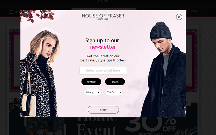
The example above shows the overlay being used on the House of Fraser website. They load it as soon you land on their website, before you even get to see the website itself. This isn’t the best use of these overlays in my opinion. Especially for those visitors who are unfamiliar with the brand, why should I subscribe to your email before I even know if I like your products and service.
Think about when you look are looking for a new coat online. Chances are you will go to Google and once you get the search results, you are likely to open the first five results all in new tabs, as well as searching for discount codes in another tab. You want to access the products and browse quickly, this will most likely be instantly closed as you flick across tabs.
These overlays have come a long way and a lot more sophisticated right down to being shown based on very specific triggers. For example a better approach for House Of Fraser to show the overlay would be a timed approach, so the popup is shown after a minute of browsing unless the visitor has started the checkout process. Alternatively the overlay could be shown on exit, when the visitor’s mouse leaves the browser, this is to capture their email address as they are about to leave.
These overlays work, our own research at Fourth Source showed this overlay increased our subscribers by over 200%.
Although I am making assumptions, House Of Fraser may have already tried various methods and found this worked best, but I’ll come on to testing later.
2. Offer value
If you want to get more email subscribers you have to offer your website visitors something to want them to give your email address. Simply asking them to sign up is not enough any more.
A good example of this is Adidas, who also make better use of the overlay than House Of Fraser.
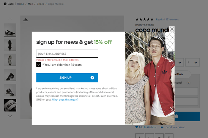
The Adidas overlay only appears when you browse any product area of the website and the value is obvious. If I am browsing the product area of the website, I am looking to buy a new product, a 15% discount is the perfect incentive. Even if I had just come to the website as an ‘online window shopper’ this may be good enough to turn me into a email subscriber and a customer.
Consider your visitors and what would be good value to them. It doesn’t have to be a discount, it could be a competition, informational eBook, webinar or something similar.
3. Make email sign up more prominent
A lot of websites do not make their email sign up form prominent enough. You can’t stick it right at the bottom of your page and expect visitors to find it and sign up.
Below is a poor placement example from H&M.
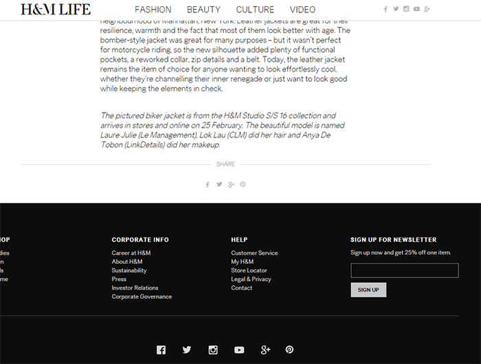
The sign up form is right at the bottom of the screen and it does not stand out at all, despite offering good value in the form a 25% one item incentive. It is no good having a great incentive if no one sees it.
H&M could easily place a form just under the main article on the page, which is the logical place for someone’s eyes to follow if they are reading the article.
4. Promote on social media
You should use all your assets to increase your email subscribers. Your social media channels represents a good place to do this. Your social media followers may not be customers yet and email offers a good opportunity to start that process.
Below is a good example from Halfords who have set up an email capture form on their Facebook page.
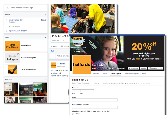
On their page, on the left hand side they have an email sign up button, which once clicked takes you to the form. Although this could have better designed with a good offer. You can also drive people to your email subscription form through Twitter, Instagram, Pinterest and other social networks.
Additional opportunities to drive email subscribers are through paid activity such as Twitter email cards.
5. Test, Test, Test
Of course with any marketing activity it is important to test, measure, refine and repeat. Every business has a different audience, you need to understand what works for your website visitors.
For example if 80% of your website visitors access your website through their smartphone, an overlay may not be the best solution as they appear more invasive and are harder to click out of on mobile devices.
It is also important to test different offers, images and copy. The testing should never stop.
I hope these tips help you to get more email subscribers. Feel free to share your best tips and tools below in the comments.

