Did you know that the three game developers that advertised their mobile games during the 2015 Super Bowl spent an incredible total of $16million on a total of 90 seconds of TV time?
We are now at a stage in the growth of mobile apps that TV advertising is becoming more popular amongst companies looking to make a big splash. What many people don’t know is that the cost of TV advertising isn’t that different to the cost of the mobile ads that everyone is already familiar with. And as the cost of mobile advertising keeps rising as more companies look to market their apps, TV becomes a more and more attractive option. So with TV rising in popularity we thought we’d share the 5 most common mistakes companies that are new to TV make, and how to avoid them.
Being too obsessed with peak slots
Many app developers like the idea of an ad being placed during peak viewing hours on the biggest channels, assuming that’s the best way to reach the most viewers. Of course, hitting people during primetime gives the ad a numbers boost in viewing terms – but it’s also the most expensive way to do advertise on TV – so until you have millions to spend, you need to be more strategic and use times and channels that are less expensive but just as effective.
Lower rated channels can be good for apps, if they perform, as they are less expensive to advertise on, and it means you can show your ad at a higher frequency. It’s also completely feasible to mix primetime ad slots with with off-peak times, with the benefit that the app gets the best of both worlds.
One company that has taken this kind of mixed approach is King, the makers of Candy Crush. Since the beginning of 2014 the company has paid to have 11 different TV spots air more than 34,000 times – helping it to become one of the most successful mobile games ever.
Poor text placement, branding and voiceovers
Did you know that the location on the screen where your text appears has a big effect on whether the ad is successful or not? A/B testing thousands of different ads on TV over the past 10 years has shown where the optimal positioning and length of text is. The science behind layouts like the Gutenberg Diagram also show where visual design elements should be placed on the screen if the viewer is to really pay attention to them.
There are also optimal ways to use product branding and voiceovers to enhance TV creative – but getting these basics wrong, can make an ad go from hero to zero in seconds. It’s important for any company that’s putting an ad on TV to run through our ‘make-or-break’ checklist for the best ad layouts:
- Upper left corner: Product logo
- Upper right corner: Company logo
- Bottom left corner: Least important text
- Bottom right corner: This is the call to action, for example ‘available on the app store’ or ‘download via the …’. People naturally scan left to right when viewing a screen, so essential info needs to go in the place they will look at last
- Voiceovers: These should have 2.5 words per second and should never go over 75 words in 20 seconds. This is so viewers can easily understand the advert without getting too much information in one short clip
- Animation: Add an animation at the end of an advert of someone using a search bar to find the app/game. This allows the audience to see how the title is spelled thus making it easier for them to find, access and download.
Not giving the product enough airtime
This is a pretty simple one: make sure you show enough of the actual product you’re selling! In the case of mobile games, create an advert that’s 30-40% actual gameplay, and don’t just focus on clever animations or expensive rendered cutscenes. Basically, the more transparent a game/advert is with its content and features, the more likely consumers will think it’s of interest and download it.
Using the same old ads
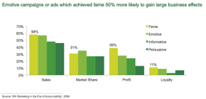
Research from Thinkbox and the IPA continues to show the importance of creativity when it comes to TV advertising. Being more creative invariably leads to people talking and sharing an ad and this leads to better results.
We’re seeing some great examples of creativity in mobile ads including the Liam Neeson SuperBowl Clash of Clans ad. Granted, it would have cost a lot of money to hire Liam Neeson, but creativity need not be expensive. The Red Bull adverts have thrived on wit, coupled with a great core concept and some pretty basic animation. There is little excuse for app developers to churn out cookie cutter adverts that don’t stand out from the crowd.
Over-targeting your ideal audience
Targeting the right audience is the most essential part of any campaign for TV advertising success. Although it’s good to hit the audience that’s likely to download your app being too narrow in your targeting means that you’ll be hitting the same people for every campaign – and you’re audience will never expand.
Media planners always advise advertisers to keep trying new channels and audiences because if the demographic becomes too small, then the campaign can end up being less cost-effective. In the case of mobile apps, don’t ignore placements that might give you a whole new audience for your app.


