Considering the fact that 80% of the global web traffic is taking place on smartphones, many of the first virtual interactions that customers have with companies is through their mobile device. Therefore, the mobile UX that companies offer should be a top priority for all businesses so that customers have a positive experience from initial search query to a final conversion.
It is incredibly important to note that Google’s own research found the vast majority of consumers agreed that they would refuse to buy from a company that offered a poor mobile experience through their website. However, ninety percent of customers who had a great mobile experience would recommend that brand to others.
Since the mobile experience is so critical to today’s consumers, it is wise to adopt a mobile-first approach to your brand’s promotion. However, you need to make sure that your mobile features match up to consumer expectations and offer them the kind of experience that is conducive to conversions.
Simplify the journey
As more and more customers make the shift from desktop interfaces, the layout and ease of use of the mobile need to on-par. Obviously, the mobile version needs to be more simplified than the desktop version; so, it is important that you narrow down your CTA (call to action) buttons and make the path to conversion super clear.
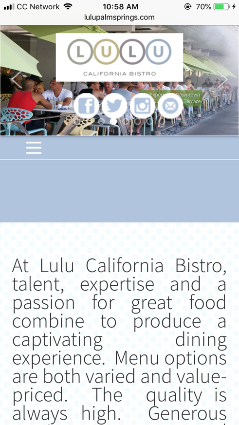
Compare the user-interfaces of these two restaurant’s mobile websites. This one has a piece of lengthy and poorly formatted text with a hidden menu bar and absolutely no clear CTA:
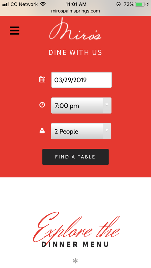
However, the other website offers two very clear purposes: book a reservation or look at the menu:
Obviously, the website with these clear messages will offer a better user experience as users are immediately aware of the purpose of the page. Your design elements encourage higher conversions only when they are clear, to the point, and direct. Make sure that every single page on the mobile version has a clear purpose. Eliminate confusion by making navigational options clear and organized and display the most common choices in larger fonts and bigger CTA buttons for easier access.
Use unique mobile opportunities for personalized perks
Personalization used to be a nice perk that some brands offered to make their customers feel special. But today’s consumer actually demands that business create customized experiences for them, particularly when it comes to mobile interactions. According to a report from Salesforce, 76% of consumers expect businesses to understand their needs and preferences and offer personalized experiences.
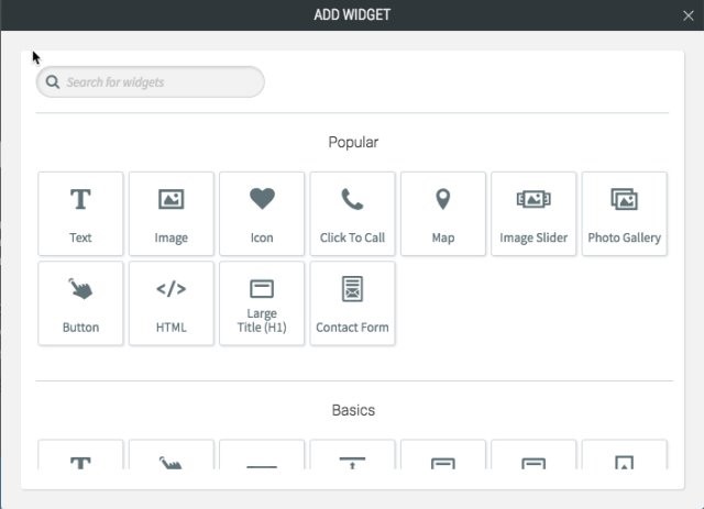
Thankfully, mobile interactions are a perfect platform to offer customers with the customized perks that they expect. For example, Duda, a website building platform for agencies, lets you take a mobile-first design approach that integrates personalized interactions based on built-in behavioral triggers. Duda can automatically adjust certain details of the website’s design based on factors like device, location or number of past visits for customized pop-ups or promotions.
So if a customer visits your site from their smartphone, you can show them a “Click to Call” button; however, you can hide this CTA if they’re visiting from a desktop or tablet.
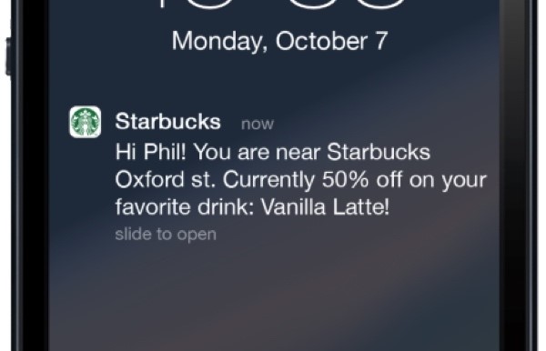
Another great option for mobile personalization is through location-based marketing. Since people use mobile devices typically when they are on-the-go, this creates a great opportunity for customized experiences based on their whereabouts. For example, if a customer arrives on your website and they are close to a specific store location, they can be sent a promotional code or an alert of a sale at that specific store.
Integrate emerging technology & trends
Another way that the use of mobile has changed consumer interactions is through the growth of voice enabled search. Ever tools like Siri and Google Assistant hit the market, customers have changed the way that they find new brands, products, and information. Voice-enabled search has changed the game for SEO.
Another emerging technology that meshes well with mobile experiences is the growing popularity of AR and VR. One of the biggest downsides to purchasing goods online is the fact that consumers cannot try the item on or see how it looks “in real life.” AR and VR solve this problem by creating virtual “dressing rooms” and “mirrors.”
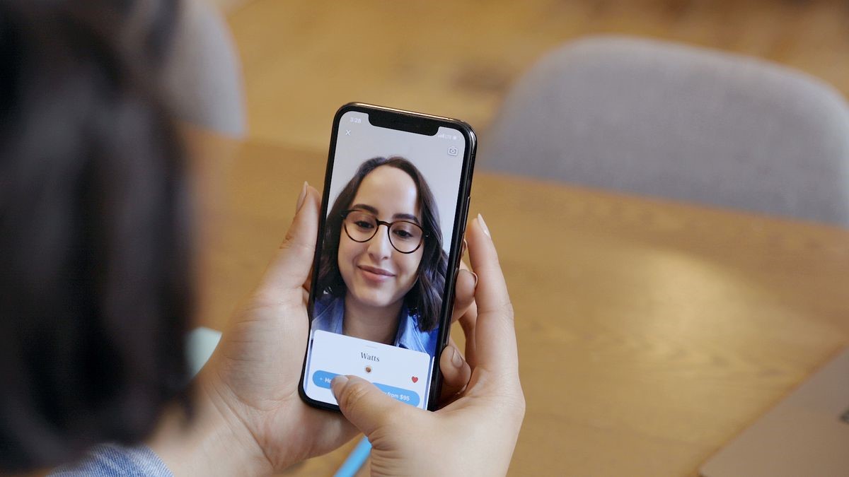
Brands like Warby Parker are using cutting edge AR technology to scan a person’s face and virtually try on different glasses frames through an app. Clothing retailers have taken things even a step further with full body scans that determines a person’s measurements for perfect sizing and custom fitted clothes.
Look for ways to test out popular technology that can be exclusive for mobile devices. This will not only help your brand stand out, but it could boost mobile brand loyalty as customers will choose this experience over others because of the tech-forward perks.
Test and experiment until you find the right mix
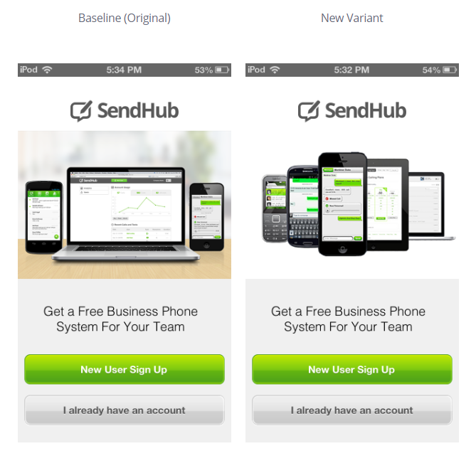
As with any business strategy, it is incredibly crucial that you are tracking and measuring the outcomes. Whether you are experimenting with mobile layouts, new features, or personalized experiences, it is important to conduct multiple tests and different approaches until you find the ones that work best.
A/B testing is the tried-and-true solution here, but it is best to supplement your testing with tools like Apptimize to help you determine how your customers are responding to your mobile design changes. This program is specifically geared toward mobile layouts and features, so you can see the direct impact that your design features are making in terms of mobile traffic and online conversions.
Over to you
The smartphone has truly become one of the most defining pieces of technology in the modern world. It has revolutionized the way that humans interact with each other and the world around them. The mobile revolution has also had a deep effect on the way that businesses communicate and engage with their customers.
Keep a mobile-first approach to your business’s website design as the majority of your customers will be interacting with your brand in this manner. Make sure that their user experience is simple and straightforward, and offers the extras that will keep them engaged all the way through the buyer’s journey.
