Peak time shopping can be a painful experience. Struggling through crowded high streets with heavy bags while every shop is having a sale can quickly zap any sense of pleasure. Thankfully, the rise of ecommerce, and specifically shopping by mobile, can remove much of the nuisance factor from these annual rituals.
According to IMRG, over half of all online retail transactions in the UK are already taking place via mobile phones, and is predicted to increase. Most likely we will be browsing sale offers from the comfort of our sofa at home, as recent research has shown that mobile shopping peaks in the evenings and weekends.
However, while retail becomes more mobile-centric, many retailers’ mobile sites still lag behind user expectation and behaviour – leading to customer frustration rather than retail opportunity. It’s a crowded marketplace and online shoppers are short of patience. If retailers want to help shoppers place orders as fast and painlessly as possible on their phones, they need to pay attention to these six key areas of digital interaction.
1. Hone the home page
In the run up to peak time purchasing – various festive shopping holidays plus summer, winter and mid-season sales – shoppers will require clear direction as they search online for specific items. Space is limited on mobiles, so retailers need to work within these parameters and keep the home page clean and uncluttered, and the signposting straightforward.
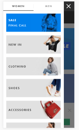
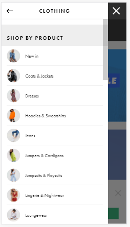
ASOS does a neat job of navigating its customers. A prominent ‘Sale’ shopping guide leads shoppers to a series of well curated and visually merchandised product pages in just a couple of clicks.
2. Pause before personalising
Personalisation was the buzzword of 2017, but it’s more of a grey area when people may be purchasing gifts for someone else. In this case, even if the shopper is a returning customer, all the information a retailer holds on them from previous visits is not relevant.
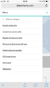
It’s far better for retailers to concentrate on optimising the customer’s chances of discovering the perfect items by providing appropriate filters, facets and buying guides, as Debenhams demonstrates.
3. Simplify onsite search
If the customer knows precisely what they are looking for, firstly make sure they can find the search box easily. Ideally, the icon should be clearly visible at the top of the home page, while the box needs to be a decent size.
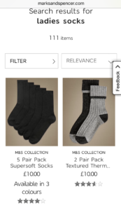
Marks & Spencer makes it easy for the shopper to search and then sort and refine the results. Rankings should be based on a balance between relevance, popularity and commercial considerations. And if you don’t stock the desired product, be honest and say so. Search is a chance for a conversation with the shopper, so be as helpful as possible. The shopper is telling you what they want and if you aren’t able to respond appropriately then you are missing an opportunity to convert an already primed buyer.
4. Be persuasive
Although best practice dictates that retailers should simplify content on mobile sites and remove non-action driven elements of a page, there are occasions when applying some gentle prompting techniques can pay off. A good example is Very.co.uk. Its mobile site flashes near-real time alerts on product pages that create a sense of urgency among users. Messages such as ‘2 people are looking at this right now’ and ‘Snapped up 100 times in the last few days’ appear briefly to assist purchase decisions.
It’s an approach that might not be appropriate for every retailer, but it could work well for those that turn over high volumes of hundreds of products and want to highlight the popularity of their bestsellers.
5. Prevent basket abandonment
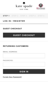
When people are shopping for sale bargains, they may visit retail sites they haven’t been to before. This is not the ideal moment to ask them to register with the site, as this involves fiddly typing of lots of personal details. It can be better to follow the approach of retailers such as luxury fashion brand Kate Spade, which avoids the risk of basket abandonment by allowing customers to buy straight away via a Guest Checkout. An account can be created at a later stage if the customer wishes.
6. Speed up
One of the big reasons we shop online is to save ourselves time. We expect to complete a purchase in just a few moments or we’ll probably give up and go elsewhere.
For online retailers, page performance can make or break a conversion. The slower the page load time, the more likely shoppers are to abandon a site. Various studies point to a 2% to 10% drop in conversion for each additional second required, so retailers should try to streamline the back end of their mobile site – for example by compressing responses to reduce transfer time, which in turn will make for a quicker page load and a contented customer.
Peak time shopping brings with it a myriad of challenges. Crafting a persuasive mobile experience that removes the bloat and focuses on speed is an essential user experience strategy for retailers wishing to entice new customers during seasonal events throughout the year.
