More so than perhaps any other product on the market, fragrances and colognes advertisements are tasked with selling more than just physical packaging, and arguably far more than just a scent. Via the visual medium of these advertisements, brands must sell an image, lifestyle, and attitude – and all in one single image.
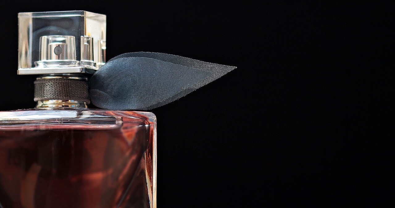
It’s all about creating a sense of mise en scène. The right actor, in the right pose, under carefully calibrated lighting and retouched in just the right way, can speak to these abstract undertones. But even the aroma’s packaging must sit seamlessly within this overall arrangement. Beauty brands invest a lot of time and money designing the bottle itself, which needs to have ‘shelf appeal’. It has to look attractive, be distinct and speak to the experience of wearing a fragrance. Whether coruscating diamond orbs or sleek black matte containers, these bottles must convey the same underlying tones hinted at by the overall ad.
That’s no easy task.
Giving life to the abstract
Creatively, visualising perfume packaging should be approached no differently than any other product.
If you’re selling the latest Bugatti, you wouldn’t simply consider the physical shape of the vehicle. The sleek silhouette and physical representation of the car is just your starting point. It’s the subtle creative touches applied that speak to the joie de verve of getting behind the wheel of the machine.
The same thinking is applied to perfume packaging. As with any marketing imagery, it’s less about the product itself, and more about the emotion in which it is wrapped.
Consider real-world examples: Burberry combines pearly golds and deep pinks in their product packaging, juxtaposing luxury imagery with sophisticated monochrome backdrops. Whereas Jo Malone ads are often lush and floral, reflecting the fact that their fragrance labels are drawn directly from nature, with names such as Lime and Basil.
On the surface level, we’re presented with something eye-catching and fresh. But there’s a deeper, nonconscious event occurring – Burberry evinces a bold, distinctive aroma, Jo Malone something more honeyed and heady.
The addition of motion blur to a sports car can communicate an exciting lifestyle; flora gently refracted through a pristine glass container can communicate a calmer, more attractive way of life. These visuals incite a deeper, emotive reaction from the buyer, even if they don’t realise it’s happening.
The power of CG
This is where it gets interesting. Conceptually, the presentation of fragrance packaging is a straightforward. But the technical challenge requires deeper thought. How do you communicate an aroma through CG lighting and modelling?
To achieve success, artists must have a grasp of the three Ps: physics, photography, and photorealism.
A fundamental understanding of photographic principles is the starting point. How should a bottle be framed and what depth of focus will present it in a manner in line with the client’s brief?
Lighting and rendering is the next technical hurdle. Artists must have, at the very least, a basic grasp of the physical properties of light. With this, they can consider the deeper implications of lighting: how should the light bounce around within the bottle? In what way will refraction affect the look of the product? Does the viscosity of the liquid or the unique curvature of the glass affect the interplay of light? Is there text embossing present? How will this impact upon the scene?
These are not easy questions. Only the most skilled lighters and renderers can answer them, and in doing so manipulate real-world, physical attributes to speak to the ad’s intended tenor, generating a deeper sense of desire in the consumer.
Bottling emotion
The main goal of fragrance advertising is not to simply evoke synesthesia by visualising smell – although this is undeniably part of the equation.
The complete solution goes deeper. A successful fragrance ad should present a narrative that’s immediately understood even following the most cursory of glances. Much in the same way that freshly cut grass is redolent of summers past, the perfect fragrance ad should evoke an emotional tone.
All details form a part of this overall image, including the packaging itself. This means considering the delicate interplay of physics, photorealism, and abstraction that interact to create the final, whole image; one that sells not just a scent but something far more instinctual.
The best Valentine’s ads are those that best navigate this subtle interplay; toying with aspects of photography, taking poetic license with physics, and exploring what’s possible with a single glass container, all in aid of a final image that speaks to something less tangible.
In today’s world of high-volume content, it’s unlikely that this imagery, once created, will ever be used in just one place. The age where a single scent samples in a magazine was enough to have been replaced by campaigns that stretch from billboards to Instagram ads, from Super Bowl halftime advertisements to Snapchat Stories.
Faced with escalating production costs and a requirement for high-quality imagery to straddle multiple channels, mass personalisation of product imagery is a must.
Configurators – technology to effectively augment CGI – can be incredibly useful in this scenario. Assets become re-usable and can be updated if necessary, integrated into any campaign regardless of lighting conditions, angles or background. Configurators present an easy solution to continuity across multimedia, at each level of a fragrance campaign.


