When looking at a new site build or re-design, it’s important to build search optimisation into its development from the ground up. We are all very aware of the on page SEO optimisations such as Title tags, H Tags, Image alt tags, content and links. However, there is little value in building a website without building SEO into its design and site structure.
At Gravytrain we work hard at integrating search optimisation with site design combining the two disciplines without sacrificing design for SEO or SEO for design, and this is vital.
The foundation for any search optimisation is research. Once we have this we can then define the site structure, internal linking and get creative with how we incorporate text to image. As expected, this process starts with keyword research specific to the client, audience and products:
- Head terms – high volume terms / highly competitive. These terms are valuable when integrated into the site navigation.
- Lower volume terms / less competitive. Generally easier to target and are good supporting terms for content.
- Opportunities outside of core head terms. These are terms not currently targeted or supported with content although closely product/service related. These terms often form part of a content strategy and in order to effectively support your SEO strategy you should build these the collective head term into the site navigation.
Once the keywords have been identified, transferring them effectively into the design and site structure is the goal. The following points can help you do this:
Information architecture (IA) is the art and science of organising and labelling data. Once you have your target head terms and opportunities you can then organise and keyword map these terms into the site navigation and internal links.
For a competitive starting point, it’s always best to compare the site structure of your competitor sites, looking for terms they are targeting and how these terms are supporting their overall strategy. When comparing across leading brands, it’s worth noting that big brands do not have to work as hard as smaller ones to gain visibility in the search engines, having little content or search related anchor text they can still be found by the search engines for those terms.
However best practice can still be seen across the following brand examples:
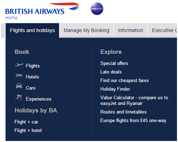
Ba.com: optimising the first navigation menu for “Flights and holidays”. They have omitted/pushed down the typical items such as ‘home’ and ‘about us’ for their key head terms.

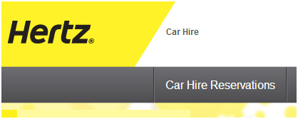
Hertz.com: optimising its first navigation menu as “car hire reservations” and omitting/pushing down the typical items such as ‘home’ and ‘about us’ for their key head terms.
But for smaller businesses the site architecture is a very important element and can really shout your authority for the terms you choose. Ideally you would include your target head terms and opportunities into the site navigation, with the first links holding the most weight.
It is also important to Build a Flat Structure into your IA, reducing potential pages buried deep within the site thus not receiving the authority from your homepage. Sticking to the 3 clicks to deepest level rule ensures that users can easily reach what they are looking for and that enough link juice is spread to all relevant pages, enabling more visibility in the search engines.
Internal linking is very important from both a user and search engine perspective. Create an internal link mapping rule to ensure you cross link to pages that users may find useful and are on topic, leading to greater engagement on site. This will also reduce the amount of Silos and spread value across the site.
Design is usually where the fight to compromise takes place to accommodate content on an image heavy site but this does not need to be the case. You can create a site that sticks to the core principles of both.
Outlined below are a few common situations and solutions for combining Design with SEO.
1. Image heavy pages with little opportunity for content and SEO.
Create images overlayed by absolutely positioned text hidden onload using Javascript. On image mouseover, the overlaying text is revealed using Javascipt. A graceful degradation fallback can be added to display and hide the text using the native CSS :hover pseudo class. This is done by detecting whether Javascript is available or not to the browser and cascading the text display properties through classes like “no-js” (no Javascript) applied to the body tag or such parent selectors.
2. Lead in text which expands (read more) on click to unveil more content.
Again Javascript can be used to hide an extended part of the text and onclick of a ‘read more’ link to unhide the remainder of the text. This can be hidden using Javascript onload or via CSS’s display:none rule. As with all methods a non-Javascript fallback should be used to display all the text if Javascript is disabled.
3. Tabs which offer further content when selected.
Tabs will reveal content based on what “tab” the user clicks on, hiding all other unrelated blocks of content. This again is a Javascript solution hiding site content that is physically on the HTML page.
4. Using Images as Links and retaining anchor text optimisation.
Create a semantic HTML list of anchors with key terms and using CSS to hide the text off screen, replace with background images specified in an external stylesheet to create the desired look.
I’ve only lightly touched on these elements for the purpose of this article, however I hope I have gone some way to explain how combining SEO and website design can be achieved without sacrificing the look and feel of the site.


